
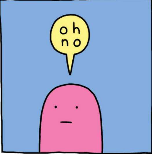
Death by the powerpoint. We’ve all experienced it, more often than we’d like. You know what it is: that lengthy presentation with a speaker reading slides tightly packed with text, font size -16. It’s deadly. We usually remember nothing from such presentations except our own boredom and our promise of never again being subjected to them. And then, it happens again: we walk into a room and then we see the first slide and we’re like
But then, let’s be honest. How many of us have inflicted the same treatment to our students? How many of us have used those awful publisher powerpoints that are basically just chapter outlines with some extra text, and often presented to us as this awesome instructor supplement? And then, we post those slides on Blackboard for student use.
And we know doing so is bad because research does tell us that students should take their own notes (preferably the old-fashioned way, with pen and paper, not on a device). But if students know we post these monstrosities online, then, there is not point for them in taking notes. They’ll also do what research shows is bad studying practice: download the powerpoint, read, re-read, and maybe highlight.
[Side note the first: incidentally, this book (not in the COD library so publisher link) has a lot of practical tips to help students develop good note-taking habits. Actually, it contains a ton of practical tips on a lot of other topics as well: getting students to do the reading, grading, prepping for exams and post-exam reviews, etc.]
And chances are, those kinds of presentations are as effective with our students as they are with us, i.e., not very.
There has to be a better way to present content.
The problem is not the content per se, but how we convey and whether we are doing so as effectively as we can. A bad powerpoint is not it. But if we are going to reconsider how we present content, then, we have to talk about design. I think we should all know at least some of the basics of design. It is actually a really interesting field. I want to recommend two general design books:
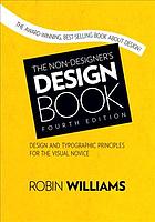
COD Library link. I like this one because it assumes no knowledge of the field and provides a really accessible introduction to the field and to the kinds of elements we should all pay attention to when we create our own content. It is actually a quick read just to get the basics right. It covers a wide variety of topics with a lot of illustrations.
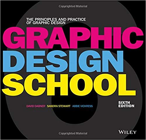
The second general design book I would recommend is Graphic Design School (COD Library link), which I got right after I had gone to a pre-conference workshop at last year’s Teaching Professor conference. I covers pretty much the same ground as The Non-Designer’s Design Book.
In both books, you learn about the principles of how to choose color palettes for effective impact (and also accessibility), how to select types and fonts beyond the software defaults, and how to pick and integrate visual elements. None of us have to be experts on this (well, except those of us who actually teach that stuff) but knowing some color theory is not a bad idea.
Then, I want to mention two books that are more directly useful are the ones more specifically about presentations and effective presentation of content.
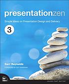
This one is a bit of a classic. Many of you have probably read the previous editions. The library has a previous edition of this book (from 2012), the third edition is from 2020. Even though I am not into all the Japanese principles, I do like how the Zen approach is woven into slide design. Also, I generally like minimalism and simplicity.
So, what are the principles that make for good presentations (zen or not)? According to Reynolds, there are six aptitudes:
- design: mostly the preparation stage when one conceptualizes what one wants to convey such as topic, objectives, while keeping audience in mind;
- story;
- symphony: being able to articulate the big pictures and otherwise unseen connections;
- empathy;
- play;
- and meaning.
This leads, of course, Seth Godin’s pronouncement of no more than six words per slide. That’s right, which sounds both insane and revolutionary. And mostly, it’s super hard. Packing a ton of text on a slide is easy. Trimming content down to six words is really challenging.
But the rationale makes sense though: if you really, really, need that much text, then, you don’t need a presentation, you need a document, a memo, a report. Now I have heard the comment before that if a document is sent to all relevant parties via email, few people will actually read them (guilty as charged here!), but how many of us remember anything of significance after the ordeal of death by powerpoint? In addition, Godin advises not to handout prints of the slides. If necessary, produce a document handed out at the end.
Another “rule” that Reynolds offers is that we should be able to tell the essence of our content in seven minutes or less. There is also support for that: people’s attentions start to decline around 10 minutes. This is where you start seeing the phones appear and people starting to do something else.
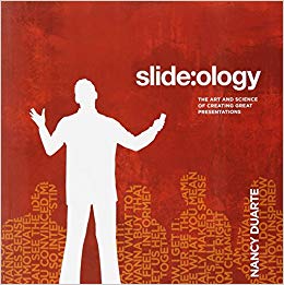
For Reynolds, this also means that any presentation should be planned by doing the opposite of what many of us do: open powerpoint (of whichever software you use) and start dumping content on slides. We should start instead with the points we’re trying to make (and why it matters, not to you, but your audience) and work from there. Instead, borrowing from Nancy Duarte’s Slide:ology (COD Library link), Reynolds recommends a storyboarding and sketching approach. And because this is presentation zen after all, simplicity should prevail along with some core design principles: contrast, repetition, alignment, and proximity.
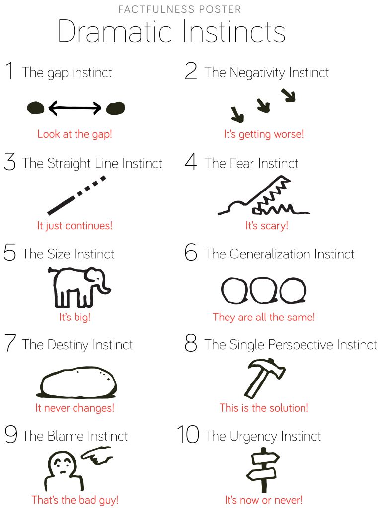
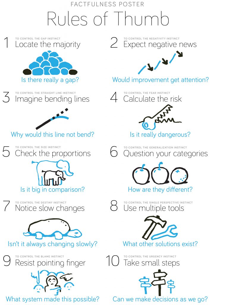
For instance, Reynolds offers as an example the contrasting posters from Gapminder’s Factfulness (a great book that you should read! COD Library link):
All the design books I have read recommend making ample use of images because of the picture superiority effect. This means, again, we have to think long and hard at which type of images would be appropriate and have an impact on our audience (and fill the slide with them). Visualizing should be central to the point being made. In this context, the rule of thirds should prevail.
Another favorite of mine is Jonathan Schwabish’s Better Presentations (COD Library link). This is one is written especially for people like us.
It is much shorter and covers the same ground as Presentation Zen but more with people like us in mind, presenting to our students or our peers.
The designing principles, though, are very similar, with more time devoted to presenting data visualizations as we often do. For Schwabish, the three core principles are visualize, unify (using similar fonts, color palettes, and other design elements across the entire presentation), and focus (as in maintain your audience’s attention through visual elements).
And also, design for the back of the room!
Schwabish also provides very helpful checklists to help jump start one’s design based on the following considerations:
- What type of presentation are you giving?
- Who is the audience?
- What is the headline message of the presentation?
- What do you want your audience to walk away with?
He also provides a detailed step-by-step process that is useful for beginners.
I want to emphasize that both books are full of before and after examples where the before slides are the ones we are used to seeing (ghastly and full of unreadable text and cheesy images), and the after slides represent the re-design with better principles.
Interestingly enough, both Reynolds and Schwabish consider presentation design more akin to billboards and comics than documents, which is what we tend to do. But there is no question that redesigning what we already do is hard, and yes, at first, it is super time-consuming.
I just spent an entire Summer redesigning a course (both content and look), and yes, one entire Summer for one course… and I was working with a designer: Nina Kim, whom I met at the Teaching Professor Conference, and who ran the pre-conference workshop I attended, and got me hooked on design. She has a great online course that I also completed: Engaging Students with Visual Design.
At the end of all this, though, you may think it’s not worth it. It’s too much work. It requires too much revising of existing materials. And will it make a difference anyway? To me, the answer is if I resent being subjected to death by powerpoints, is it really ethical to turn around and subject my students to the same thing? And hey, maybe you don’t need a presentation at all. I often don’t use them. I grabbed the visuals and charts and graphs and videos I need for a session and I go with that.
I also see this as no different than using best practice in pedagogy. Presentation design is best practice.
One more thing: you can end up with more effective content with less text (so much less text). Your students will still need to take notes (and in connection with the presentation and visuals, they get a fuller picture), and even if your content ends up on Course Hero, Chegg, or whichever unethical website steals our content, it won’t be much help and less likely to lead to plagiarism.
[Side note the second: I am ambivalent about this.]
I should end by stating that I make no claim whatsoever to being a designer. However, I think a lot about this kind of stuff and I have used different tools to present content (to some of you no less!). In a future post, I will share the tools that I use on a regular basis
