
Greetings, colleagues.
For this first post, I thought I’d just do a basic overview of the Ultra Course View (UCV) in comparison with our current course view. This will give you a first impression of what to expect.
So, here is the basic landing page of my 8-week online course in our current course view:
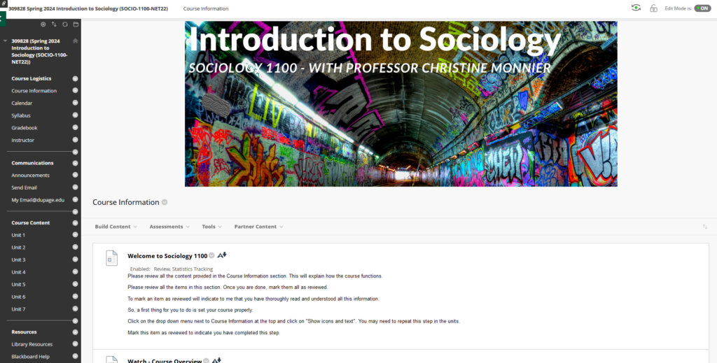
This should look familiar. I usually populate the left sidebar with all the content and course tools I want, broken up into different categories (logistics, communications, content, resources). Back in the Pleistocene, you could even use buttons on the sidebar and customize them to give your course exactly the look you wanted. That option was removed several upgrades ago, so now, our sidebars look the same. But besides the look, you can customize your left sidebar with as many or as few elements as you want, with separators and headers. With the layout I have makes the sidebar the main way to navigate the course. Obviously, your courses will be different, but the core elements will be the same, in one form or another.
Now, what does the same course look like in the UCV? Well, it looks like this:
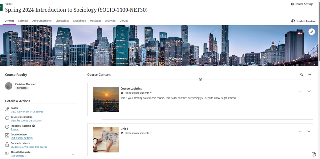
Pretty dramatic difference, uh? The first thing to notice is that there is still a left panel, more than a sidebar. There is also a set of menus at the top. Those cannot be customized. At the top are the core course wide items:
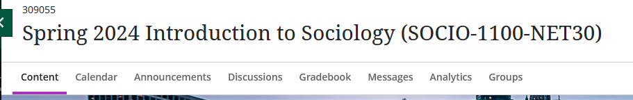
The content tab is selected by default. This is your landing page. The purple underlining indicates which item you are currently viewing. You can see that these items are pretty standard. In future posts, I’ll go through each of them.
Again, these items cannot be changed or moved or deleted. However, you don’t have to use them all, if that does not fit with your own course. But whether you use an item or not, it will still be in that top menu.
This top set of menus (minus the Analytics tab) will also appear in that form in the student view.
The left-hand pane also looks completely different from the “old” left sidebar. It is not customizable either. You can use or not use some of these items, or turn things on or off, but these items will otherwise stay as they are. It also looks pretty much the same to the students.
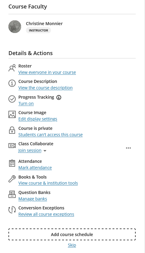
The roster item is pretty self-explanatory.
Don’t get excited about the course description, it’s not the stuff from your active course file. In this case, it’s a link to the online class format.
Progress tracking is an option I’ll keep turned off for now because we are still exploring what it does exactly, that is not otherwise available through the gradebook.
I’ll have a whole post about attendance and using test banks.
And then, if you have a face-to-face, hybrid, or VCM class, you might want to add the course schedule. If you do, this will open a panel where you can enter your course session information:
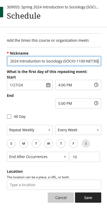
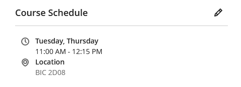
Once you set this up and save, your course sessions will be added to the course calendar, as non graded items. Now, this is a net class, so there are no live sessions. But I did it for my face-to-face class, and once you set your course schedule, this it will show this instead of “Add course schedule”.
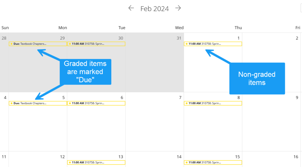
And then, you can now see the sessions in your course calendar:
Now, you do not need to add a course schedule to your calendar if you don’t think your students will need one. It’s an optional feature, but a quick-and-easy one to add, if you think it helps.
That’s it for your first quick-and-dirty exposure to the UCV and you’ve already learned how to do one thing.
As I mentioned, I will dedicate specific posts to the core items of the UCV. I’m also taking requests, if you guys want to see something in particular. And if I don’t have the answer, I’ll ask our Learning Tech colleagues to take a stab at your questions.
Side note: the screenshots and annotations were done with Snagit.
Christine
