
So far, my posts on Panorama have been about setting it up, and getting started on fixing individual items in a course. It’s great, but sometimes, it’s helpful to have a broad, bird’s eye view of an entire course in terms of accessibility.
Thankfully, YuJa Panorama can generate an overall accessibility score for an entire course. That score tells you how much work you have to do to fix the issues and make your course more accessible.
How does it work?
Start in the Tools area in Blackboard and find YuJa Panorama:
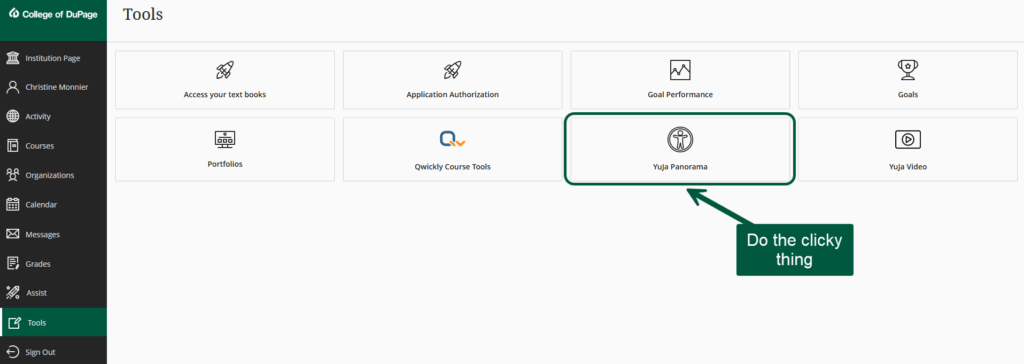
Click on YuJa Panorama to open the LTI. On the next screen, you will be prompted to select the course you want to work on.
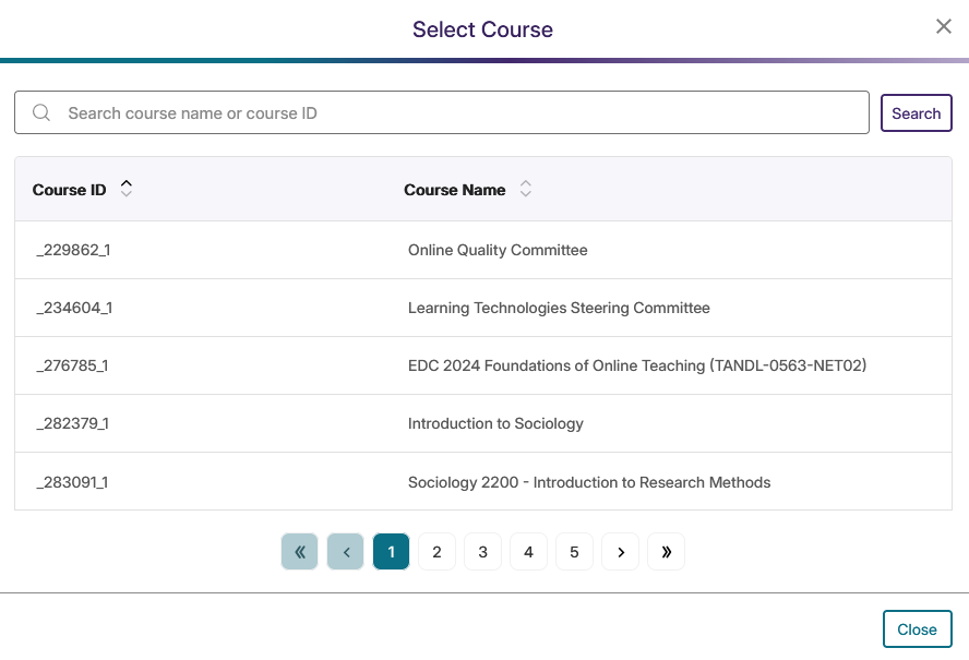
Go look for the course you want. This will open a dashboard with a plethora of information.
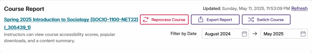
This is what it looks like for one of my past courses, before I installed and used Panorama.
The first item on the course report that is generated gives you some export options if you want to keep a record of your reports. That’s the kind of stuff I would add to my evaluation submission, for instance.
Needless to say, I ain’t touching that one:
Actually, I lied. I tried it to see what it would do, so I could tell y’all. Anyhoo, unsurprisingly, the results were, shall we say, erratic.
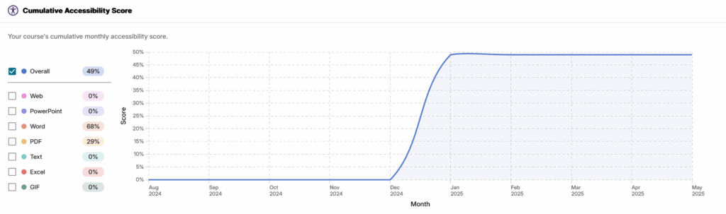
The next set of items is where things get serious:

Yikes. 49% means I have some work to do. Now, remember, this is a past course, with no fixes applied, and the alternative format downloads were not available, so the rest of these scores is not surprising.
Then, Panorama also gives you your accessibility breakdown by file types present in your course.
Yeah, Panorama does not like PDFs, so I’m gonna have to switch more to .docx files.
In case you wonder how much work is involved in fixing everything that needs fixing, I have good news. Not much, unless your course is a hot mess.
For instance, I started working on one of my Fall 2025 courses. Once I got more comfortable with the app, and the different options, I got things done quickly. I’m pretty sure I’ve spent less than an hour, total, on that course so far, and check out my accessibility score (same course as the one above):
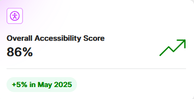
That’s a pretty nice gain for less than an hour of work.
Broken down by content type:

Ok, so my PDFs still kinda suck.
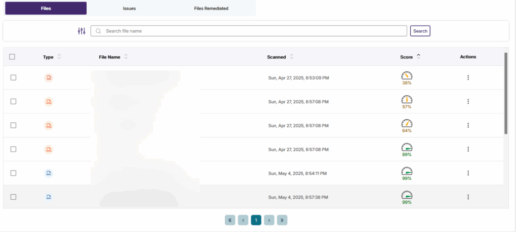
But how will I know exactly what I need to fix? Easy, keep scrolling to the bottom of the dashboard until you get to this:
Under the files tab, you will find all your file, their type, and their individual accessibility scores.
From there, you can click on the dial or the view option:
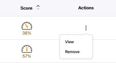
This will open a panel where you can see the details of what Panorama is flagging. For instance, I know that first file, with a 38% is kinda of a hot mess that I should have redone a long time ago.
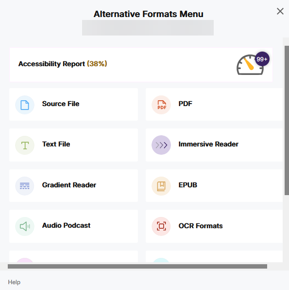
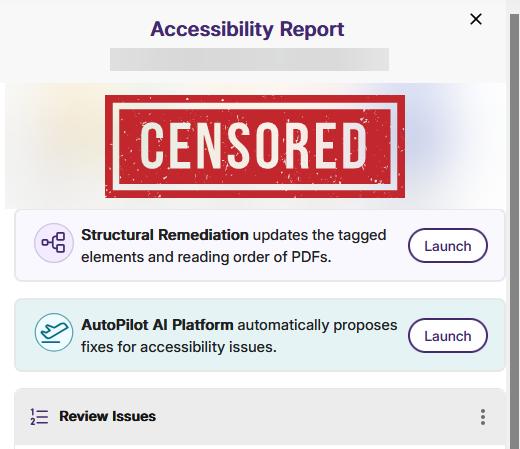
<Insert laughing – crying emoji> Yeah, 99+ issues means, I’m just going to redo that document. And if you click on that dial, you get a more granular breakdown, that I’m embarrassed to show you.
Anyhoo, that dashboard is a treasure trove of accessibility information about your course and its elements, and it’s well worth diving in and making the changes that need to happen so we can meet the April 2026 deadline. It’s probably less work than you think.
As always, you should contact the Learning Technologies office for assistance with this. Look out for some specific training on the topic of accessibility in general, and how to use Panorama, in particular.
