
Obligatory disclaimer: I am not a designer. This is not my field. I’m just a community college prof trying to use best practice to the best of my abilities.
In this post, I want to showcase some of the tools that I use the most commonly with respect to design. Again, I make no claim to doing things exactly right. A lot of it has been trial and error over the years. Also, new tools come up all the time, and I do try to keep up but I’m sure many of you use different tools. The ones I use are not the only ones nor necessarily the best ones. They are just the ones that work for me and my workflow. Moreover, there may be tools that are field-specific and that may not work well outside of the field for which they were designed.
So, go with, you know…

Lastly, in my previous post, I referred to several books on design in general, and design principles as applied to slides. These books are more manuals than anything else. What this means is that they are not “read once and done”. They are books that I go back to often to refresh my memory of the principles listed or to look for a specific example that can help me out of an issue I’m trying to solve. So, I always have these books at hand for when I need them.
I also did mention in my previous post that I have worked with designer Nina Kim. The flyer below is freely available for download from her website. I also have a pdf version in case anyone is interested:
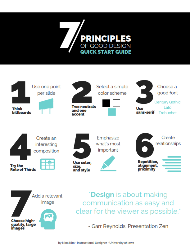
I like this because it is a quick an easy way for me to remember what I am trying to do (and what to avoid) when I am designing presentations or other types of documents.
And again, this is not choosing form over content. All the designers I have read show that content is better conveyed and remembered when care is given to design and when design is an integral part of the content shared, not an afterthought, or the nice thing you do if you have the time.
Last preliminary consideration: most of these tools are free or have free versions that can be upgraded for more bells and whistles. I love the bells and whistles so, if it’s affordable, I’ll get an upgrade. Depending on cost, I have used my professional development funds for tools, especially those that I use the most. My dean has never rejected any requests for tool funding. My threshold tends to be $100. But frankly, I often just forget to ask because I tend to not think that way.
Ok, so, that was lengthy preamble. Enough pontificating and on to the fun stuff.
First off, here is a video of the workflow and tools I used to redesign the look and feel of my Social Problems course last Summer. I worked with a designer on this:
Again, I do not claim that this is the one correct way to do this but it worked for me and for this particular course.
Since I mentioned Canva (again: free pro version for educators), I should also mention that Canva has a lot of cool tutorials on design, which they call their Design School. One Canva tool, out of the design school, I have used a lot, is their color wheel. The color wheel allows you to create color palettes based on the principles of color theory (explained in the design books mentioned in a previous post, and at the color wheel page). However, if the bulk of your presentation or content is data visualization, Canva is limited in what it can do.
Here is how it works and how to create palettes that are accessible, with enough contrast and with color blindness in mind:
There are a lot of other tools that you can use in order to create your own presentation materials. Canva gives you access to a lot of shapes, fonts, and images.
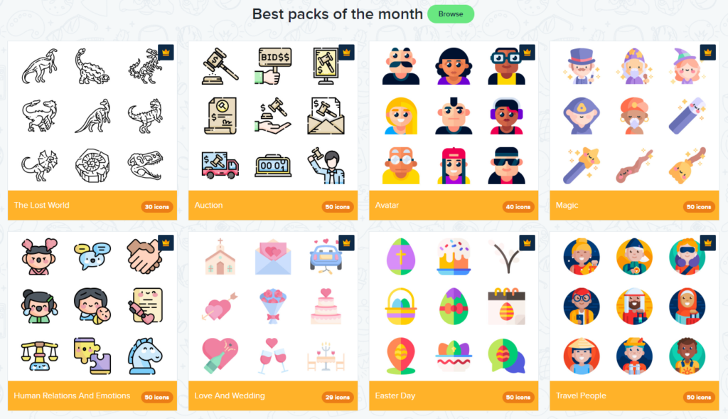
If you are looking for nice photos that don’t look like cheesy stock images, you can use Unsplash or Pexel. I also like to use icons, so Flaticon is my favorite site because there’s really a ton available icon packs (remember, unify!) that can be customized and downloaded in different formats and different sizes. For instance, you can change the color of the icons to match the color palette you have selected.
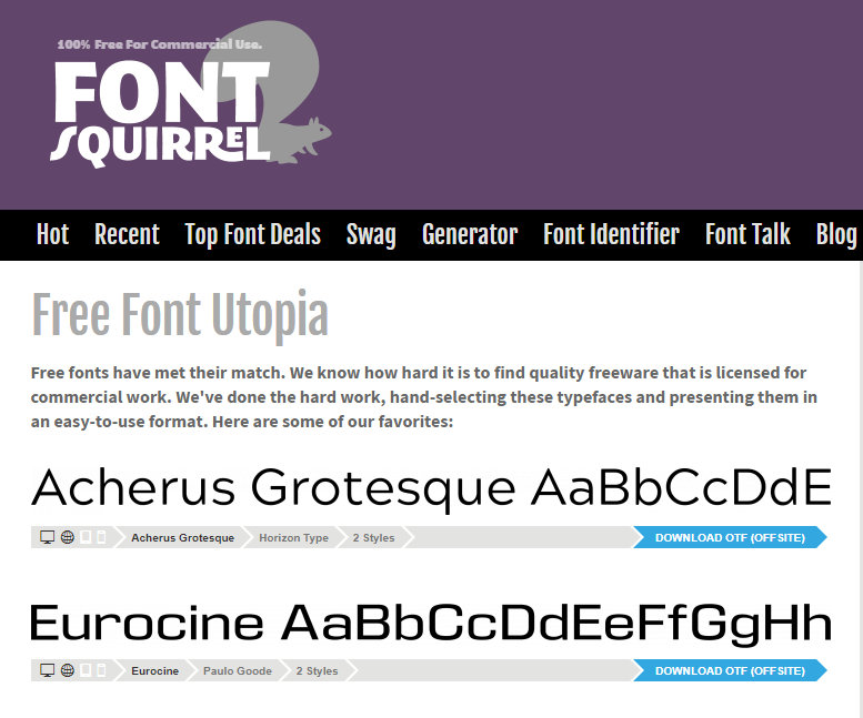
In addition, Canva gives you a lot of choices of really good fonts. The problem is that if you then download your document to edit in Powerpoint or other software, that software may revert to default fonts if you have not yet installed it. In this case, one option is is to use Font Squirrel to find and download entire font families.
If you use Canva, the simplest option is to run your presentation directly from Canva. This is what I did when I presented at the Instruction panel on alternatives to grading. That way, you don’t have to worry about compatibility. Just open a browser and you’re good to go.
As you can see, there’s a diversity of tools to use depending on your content and purpose. And even though there are some principles of design that apply to pretty much any type of presentation (design for the back of the room!), there is no one-size-fit-all when it comes to the end result since we all deal with different content and challenges.
As always, thank you for reading.
Christine
