Infographics are everywhere these days, from Twitter feeds to cereal boxes. And with good reason: they make it easy to share data and important information in an easily digestible and engaging format. Infographics might look complicated to make but in reality, anyone, even those who aren’t design experts, can make one. The process can actually be relatively simple, especially if you’re using the right tools for the job. So settle in and less us show you how to start creating amazing infographics for your courses.
Why Infographics Work and What the Best Ones Do
Why use infographics? Infographics make it possible to communicate complicated or even traditionally less exciting information very quickly and while keeping your audiences’ attention. They’re also a really great tool for consolidating big ideas (or data sets) into a few key points.
But not all infographics are created equal. To make an effective infographic, you need to adhere to a few basic principles of design:
- Have a clear focus. The point of an infographic isn’t to contain ALL the information on a topic. Pick and choose an element to focus on or broad themes. This way, your infographic won’t ramble on or become visually confusing.
- Cite your sources. You tell your students this all the time when they’re writing papers, but the same is true for infographics. It should be clear where your information (numbers, facts, whatever) is coming from. This gives the infographic legitimacy, but also makes it easy for students to know where to go to learn more.
- Keep readability in mind. The idea of an infographic is to present information visually, so the same design principles that would apply to any other kind of visual document still apply here. Be conscious of elements like contrast, white space, color, alignment, and repetition. Your aim is to maximize readability and minimize confusion.
Finally, don’t forget to have fun!

This is an example of an infographic a student made. Copyright Jasrelle Serrano
How to Use Infographics in a Course
How you use infographics in a course will depend on your subject matter, your students, and the infographic itself, but here are a few basic ways that infographics can be integrated into most course content, online or off. These are taken from the California Academy of Art and Sciences. You can find lesson plans, handouts and more on their site’s toolkit.
Interpreting Infographics For this application, you’ll need to make or find infographics related to your course content. Then, students will look at them critically and address things like where the data comes from, the overall success or failure, and the main idea the graphic is trying to convey.
Making Infographics Students often love getting creative and making an infographic can be one way to allow them to do that. They can choose the data visualization strategy they think works best and use one of the tech tools we’ll talk about later to build their own infographics.
Critiquing Infographics This activity allows you to turn a critical eye to infographics, analyzing them using whatever criteria make the most sense for your course: accuracy, design principles, effectiveness, storytelling, etc.
Of course, you can also simply use an infographic as a visual element in your course, as you would a picture, graph, or chart–no entire lesson around it is needed.
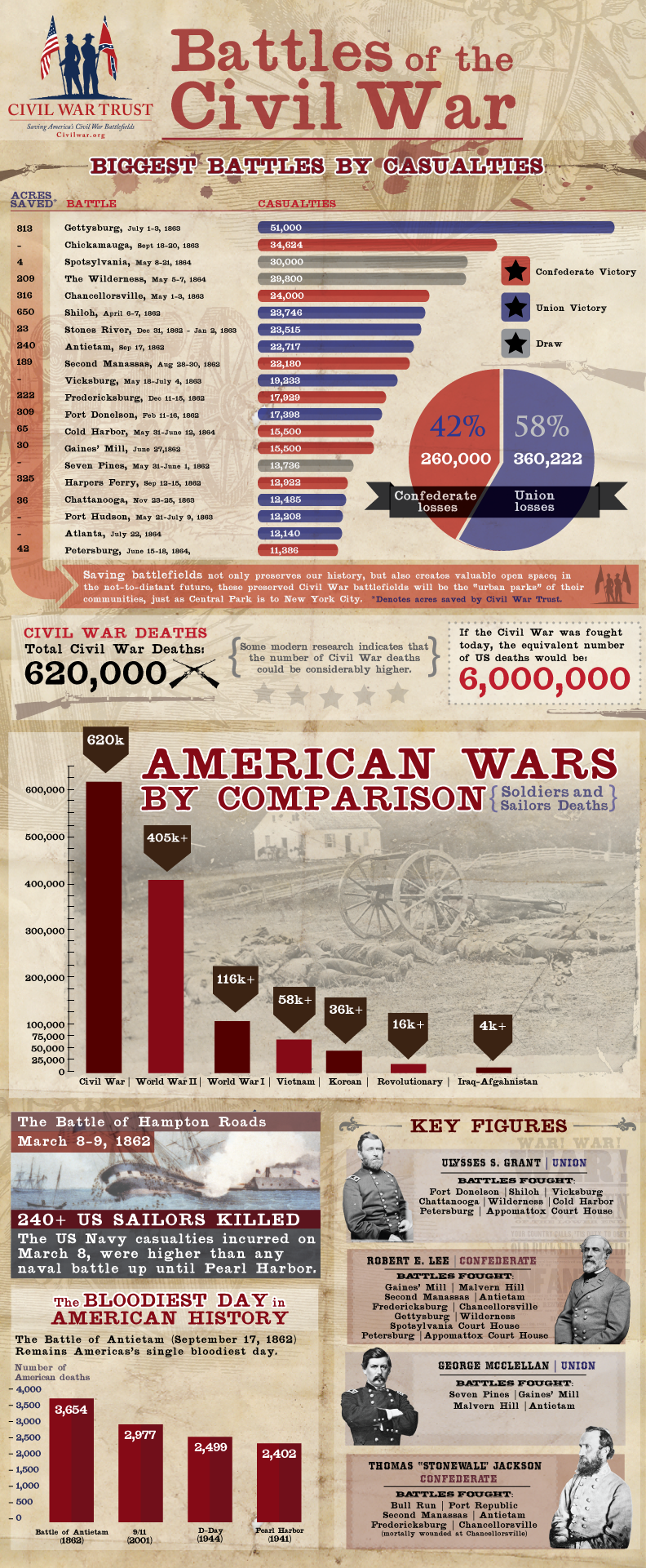
An example of an infographic from the American Battlefield Trust. More information here.
The Process of Creating an Infographic
If you’re really not the design type and are not interested in creating your own, don’t give up on infographics! There are plenty of infographics others have made that can apply to just about every topic under the sun, all you need to do is find them. The New York Times has some examples here, but this is by no means an exhaustive list of all the infographics out there.
But if you’re up for making your own, the process is fairly straightforward. Let’s get started!
- Gather your data/content. The first step to creating an infographic is to find the “info” that you want to put into graphic form. Generally, infographics focus on numerical data or short facts or tidbits of information.
- Find a narrative. The best infographics use information to tell a story. For example, “The Rise and Fall of MySpace,” “World’s Deadliest Dicatorships,” or “The Anatomy of a Classical Statue.” Whatever your story, figure it out before you get started and make sure your data/info helps you tell that story.
- Sketch it out. Making a sketch before you start can help you work out a lot of the issues you’ll encounter before you’re too deep in the process to want to make changes. Figure out the layout you want (examples of layout types can be seen here), what images you’ll need, and how everything will work together. This can also be a good time to write out the actual text you want to include so you’ll know how much room it takes up. Remember, keep it simple!
- Choose a style. There are countless visual styles you could choose to use when creating an infographic. Choose the one that appeals to you or makes sense with the type of content you have. Just make sure that whatever you choose will be easily readable by students.
- Build it. Once you’ve done all the planning, it’s time to get to the real work of creating your infographic. You can use any design tool you choose to create your graphic, but check out our list below for some resources that will make the process as simple as dragging and dropping.
- Get some feedback. Before you unveil your infographic(s) in your course, make sure to get some feedback first to ensure that everything is clear, concise, and will be able to be understood by your students.
- Share! Share your work with your students, colleagues, or anywhere else you care to spread your infographic goodness.
An example of an infographic made with Canva.
Infographic Tools
Making an infographic is a whole lot easier when you use the right tools for the job. Here are a few of our favorite sites for making infographics.
- Canva: We’ve posted about Canva in the past—we love it! It’s also a really amazing free tool for creating infographics. You can build your own or take advantage of existing templates. Either way, the site’s drag and drop functionality makes it super simple to get up and running. If you’re designing with a lot of charts and data, however, you may want to choose a more infographic-specific tool.
- Visme: With Visme, you can create interactive presentations and infographics, as well as other types of graphics that might be useful for educators.
- Piktochart: Depending on the plan you choose, Picktochart runs from $12-$40 a month, which makes it probably most appropriate for those who are really into infographics or other kinds of visualizations (presentations, flyers, posters, etc). If you’re willing to shell out, however, its large range of options and easy drag and drop functionality make it among one of the best choices for infographics.
- Infogram: Infogram is a great tool if you need something that can quickly create graphs, charts and other data visualizations. Basic options are free but you can get pro features with a paid educator plan.
Resources
Learn even more about creating infographics with these resources:
12 Infographic Tips That You Wish You Knew Years Ago
How to Create Stunning Infographics in 30 Minutes or Less
10 Steps to Designing an Amazing Infographic
Teaching with Infographics: Places to Start
Infographics as a Creative Assessment
How to Make Infographics: A Beginner’s Guide to Data Visualization
Tips, Tricks and Resources to Make Your Own Gorgeous Infographics
Already using infographics in your courses? Share your work here! We’d love to see what our faculty are creating.
